Webapp
The Webapp is the member-facing PWA — the page members open from a link, a QR, or after they've installed it as an app. It's where they see their balance and gifts, scan to pay, browse menus or branches, enter coupon codes, and download their Wallet Pass.
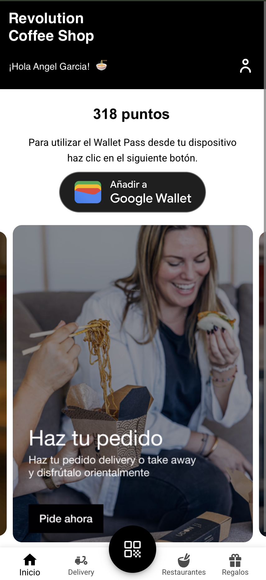
The whole Webapp design is self-service. Under User Interfaces → Web app you'll find the App Editor: brand colors, every screen and its components, popups, install behaviour, and advanced style overrides. Changes are saved to a draft, so nothing your members see changes until you hit Publish — and you can Preview first and roll back later from History. The most common day-to-day edit is still the home-screen carousel: swapping banner images and what happens when a member taps them.
The App Editor
This section describes the classic editor. Businesses are moving to a new editor one at a time. See Which editor do I have?
Open User Interfaces → Web app in Hub. The left panel is the editor's map; the canvas on the right shows the settings of whatever you select.
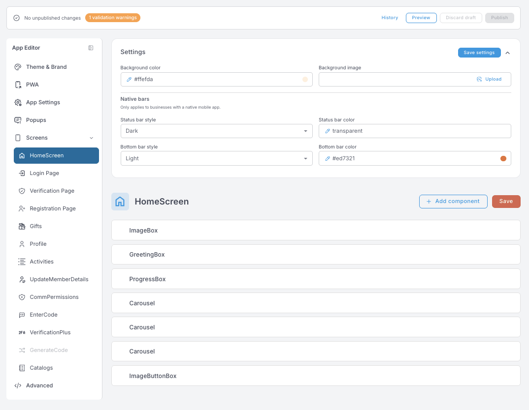
The editor is organized in six areas:
- Theme & Brand — the global look: brand colors, corner radius, logo and favicon, font, and the navigation bar.
- PWA — how the app presents itself when a member installs it to their home screen.
- App Settings — artwork and colours for a native mobile app in the app stores. Different job, different audience, so it has its own page: Mobile app.
- Popups — messages shown after login, anywhere in the app, not tied to a screen.
- Screens — one entry per screen of the app: the home screen plus the built-in pages.
- Advanced — raw style overrides for edge cases the regular panels don't cover.
The rest of this page walks through those areas. It doesn't list every box — most colour and size fields do exactly what their label says — but it does cover the ones worth understanding before you change them.
Draft → Preview → Publish
Nothing you edit goes live directly. Every Save writes to a draft; the top bar tells you whether unpublished changes exist. From there:
- Preview — see the draft exactly as members would, before committing.
- Publish — push the draft live to all members.
- Discard draft — throw away unpublished changes and return to the live version.
- History — every published version is kept, and you can roll back to any of them.
The top bar also shows validation warnings when a setting has a value the app can't interpret (say, text where a number is expected). Fix warnings before publishing — the draft is checked continuously, so the badge updates as you edit.
- Every save button —
Save draft,Save settings,Save list,Save— writes to the same draft. Nothing reaches members until you press Publish. - An empty colour field usually means "inherit" — the app falls back to the theme.
- Wherever you see Insert token, you can drop member data into the text (name, balance…), so one string personalises itself per member.
- Icon fields want an Iconify name like
tabler:plus. Font Awesome classes are ignored by the app.
Theme & Brand
The global look. Change something here and every screen follows.
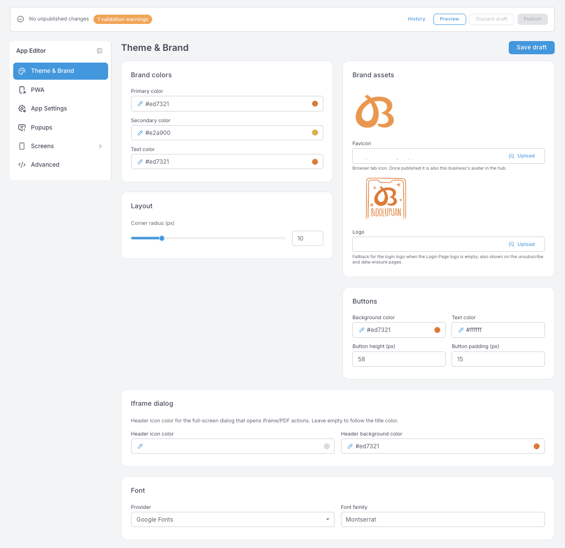
- Brand colors — primary, secondary and text. The rest of the editor falls back to these, so set them first.
- Layout → Corner radius — one number, applied to cards and buttons across the app. Individual panels can override it.
- Brand assets
- Favicon — the browser-tab icon. Once published it is also this business's avatar in the hub, so it shows up in places you might not expect.
- Logo — the fallback for the login logo when Screens → Login Page has no logo of its own, and the logo shown on the unsubscribe and data-erasure pages. Setting it here covers all three at once.
- Buttons — background and text colour, height and padding for the app's standard buttons.
- Iframe dialog — the full-screen dialog that opens when a member taps something that loads a PDF or an external page. Leave Header icon color empty and it follows the title colour.
- Font — choose the provider, then type the family name exactly as that provider spells it.
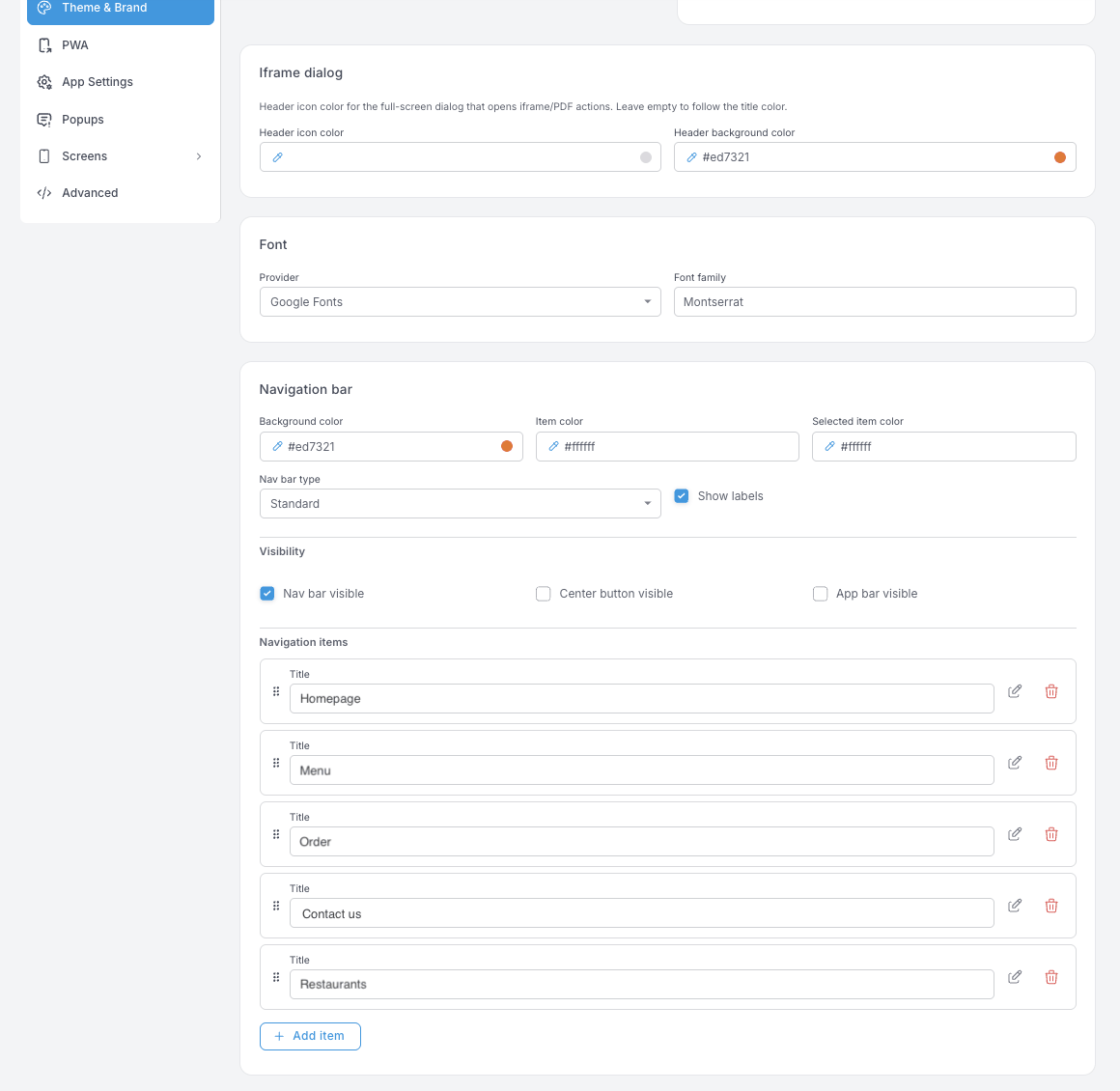
- Navigation bar — the bar along the bottom of the app.
- Nav bar type and Show labels change its shape and whether item names appear under the icons.
- Visibility — three independent switches: the nav bar itself, the center button (the raised round button some layouts use), and the app bar across the top. If you turn the nav bar off, make sure the home screen gives members another way to reach the other screens.
- Navigation items — drag to reorder, pencil to edit the label and where it points, trash to remove. This list is what members actually tap, so keep it to the screens they use.
PWA
How the Webapp behaves once a member installs it to their phone's home screen. This is the installed website, not the native app in the stores — for that, see Mobile app.
Changes here don't refresh already-installed apps. A home-screen icon keeps its old name and image until the member removes it and installs it again.
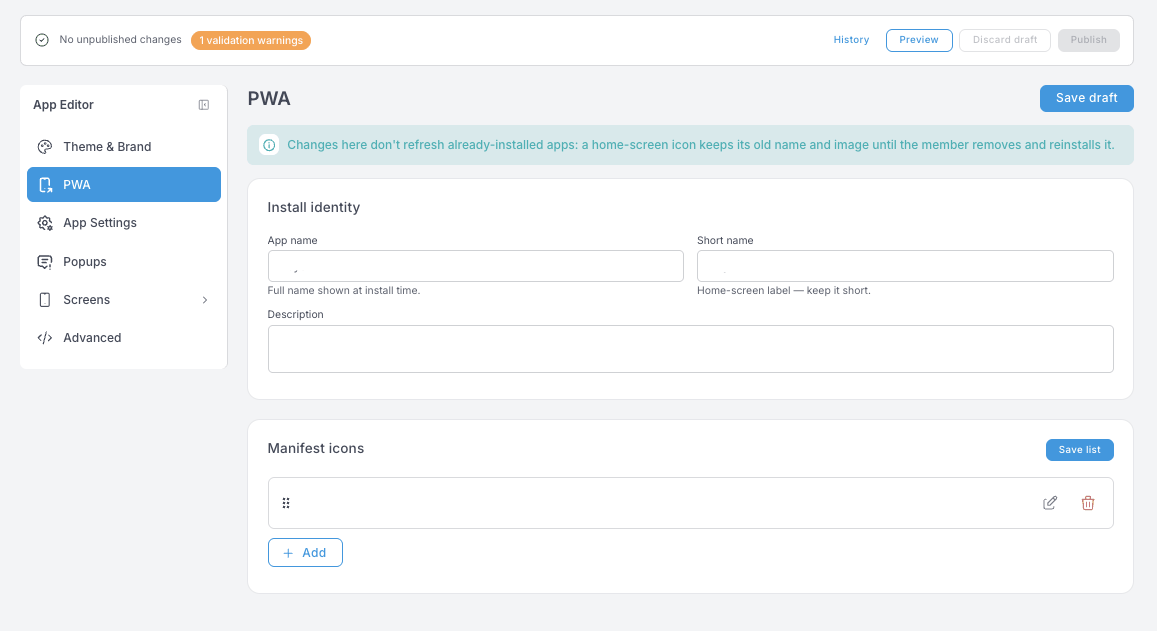
- App name — the full name shown at install time.
- Short name — the label under the home-screen icon. Phones truncate long labels, so keep it short.
- Description — shown by some browsers on the install prompt.
- Manifest icons — the icon set the phone chooses from when it draws the home-screen icon. Save list saves this block on its own.
Popups
Messages shown after login, on top of whatever screen the member is on — not tied to a particular screen.
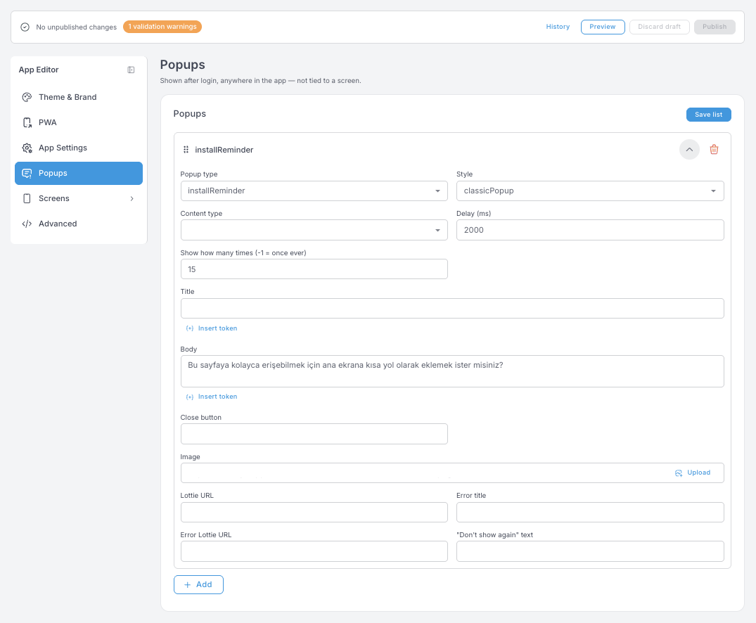
- Popup type — what the popup is for.
installReminder, for example, is the "add this app to your home screen" nudge. - Style and Content type — how it's presented and what goes inside it.
- Delay (ms) — how long after login it appears.
2000is two seconds; give the screen time to load first. - Show how many times — the frequency cap per member.
-1means once ever; any positive number is that many showings. - Title and Body — the text, with Insert token for member data.
- Close button and "Don't show again" text — leave them empty and the popup uses its defaults.
- Image or Lottie URL — a still image or an animation. Error title and Error Lottie URL cover the case where the popup's action fails.
Save list saves the whole popup list at once.
Screens
Screens come in two flavours.
HomeScreen is a canvas
The home screen is a stack of components you add, reorder, duplicate and delete. Each one opens into its own settings panel: content on one side (image, text, link), look on the other. This is where most of the visual personality of your app lives.
Above the stack, the screen's own Settings block sets the background colour or image, and the native status and bottom bars.
The </> icon on a component opens its raw configuration. It's handy for copying a component from one place to another, but the same caution applies as in Advanced — there's no validation on what you paste in.
The carousel — your banner space
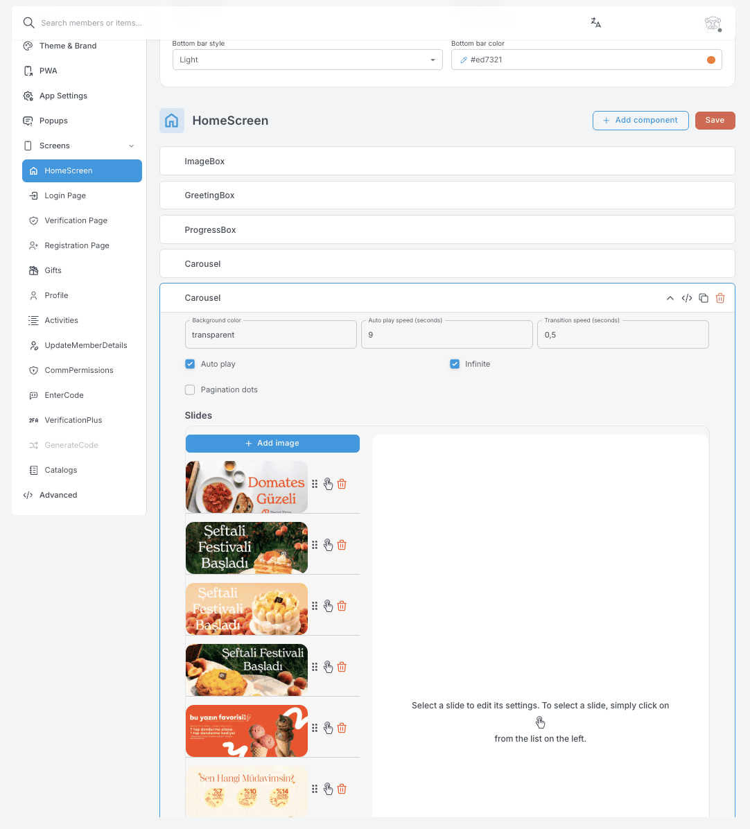
The carousel is the most-edited component and works like a rotating banner space. Per slide you control:
- The image — add, remove or reorder slides; each slide is one image.
- The action — what happens when a member taps it: nothing (decorative), open a popup, open a URL (inside the app or in a new tab), trigger the "install this app" prompt, download the Wallet Pass, open directions, or start an email.
- Who sees it — optionally limit a slide to members with specific tags. Leave it empty to show the slide to everyone. This is how you run VIP-only or segment-specific banners inside the same carousel.
Carousel-wide settings sit above the slide list: background colour, Auto play with its speed in seconds, Transition speed, Infinite for endless looping, and Pagination dots for the position indicator.
A home screen can hold several carousels, and many businesses use a single-slide carousel as a tappable banner-button.
The other screens are built-in
Login, Verification, Registration, Gifts, Profile, Activities and the rest have a fixed layout. What you edit is their wording — screen titles, button labels, empty-state and error messages — and their look: background, card styling, icons. That keeps every flow working correctly while still letting you match your tone of voice in every language.
Two things most of them share:
- A Disable screen button, which takes the screen out of the app entirely. The core sign-in screens don't have it.
- Native bars — status and bottom bar style, only relevant if your program has a native mobile app.
GenerateCode appears greyed out when that feature isn't enabled for the business.
Sign-in flow — Login, Verification, Registration, VerificationPlus
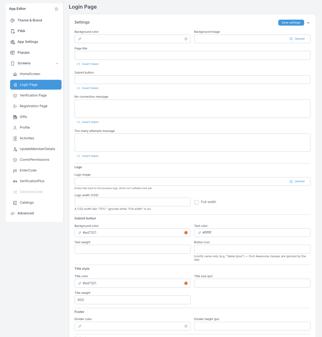
Login Page — page title, submit button label, and two error messages (No-connection, Too-many-attempts). The Logo block is a per-screen override: leave the image empty and it falls back to the business logo set in Theme & Brand. Logo width takes a CSS width such as 70% and is ignored while Full width is on. The rest is styling for the submit button, the title and the footer divider.
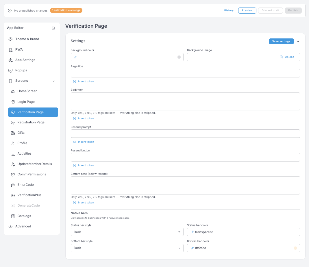
Verification Page — page title, body text, the resend prompt and button, and a bottom note under the resend line. In the rich-text fields only <b>, <br> and <i> survive; everything else is stripped.
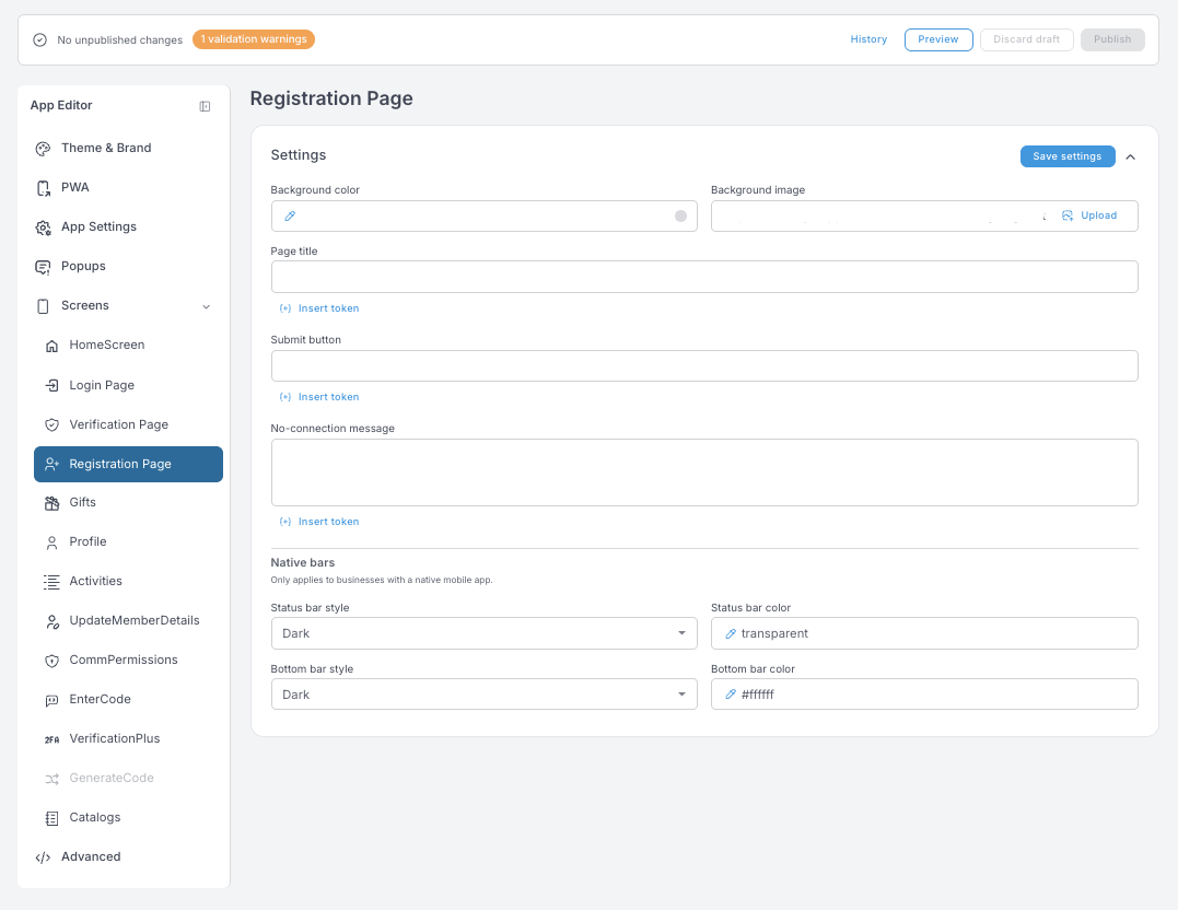
Registration Page — page title, submit button, no-connection message.
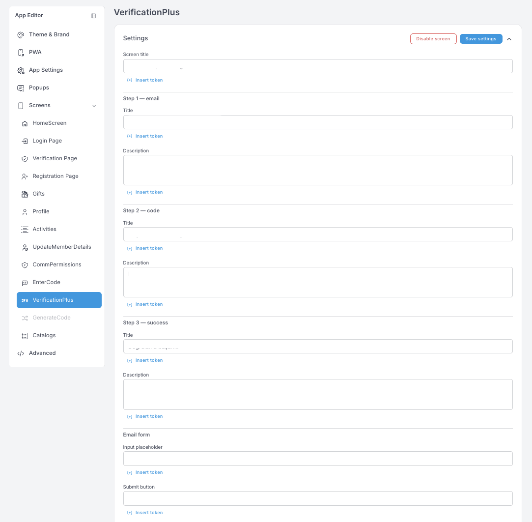
VerificationPlus — the three-step email verification: Step 1 — email, Step 2 — code, Step 3 — success, each with its own title and description, plus the email form's placeholder and submit label.
Member screens — Gifts, Profile, Activities
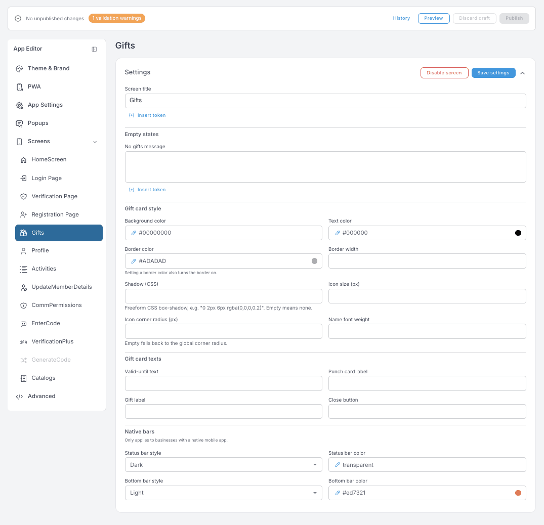
Gifts — screen title and the No gifts message empty state. Gift card style shapes the card members see: note that setting a Border color is what turns the border on, and an empty Icon corner radius falls back to the global corner radius. Gift card texts cover the valid-until line, the punch card label, the gift label and the close button.
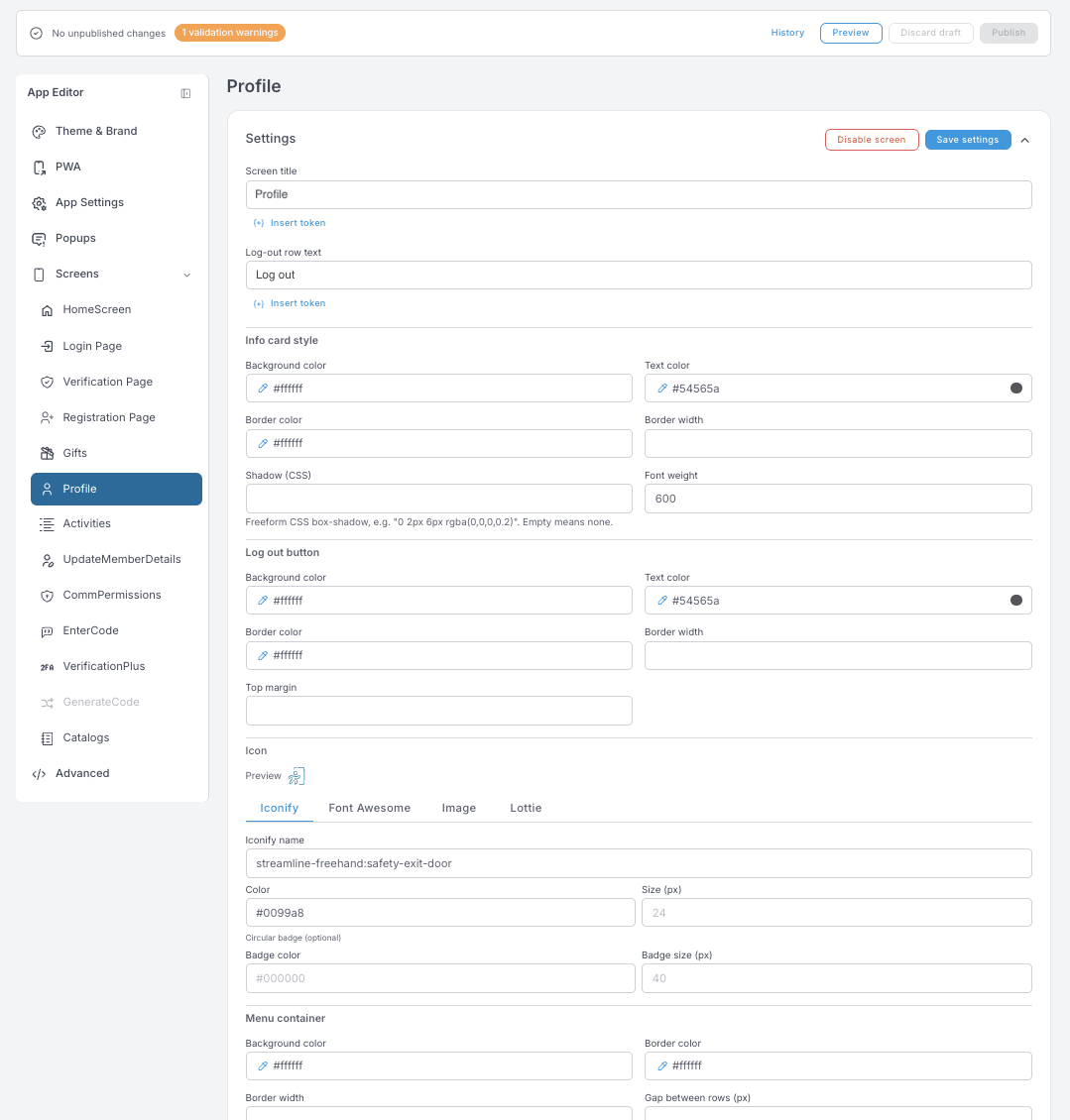
Profile — screen title, the log-out row text, and the styling of the info card, the log-out button and the menu container. The log-out Icon can be an Iconify name, a Font Awesome icon, an uploaded image or a Lottie animation. Divider color only shows when Gap between rows is 0.
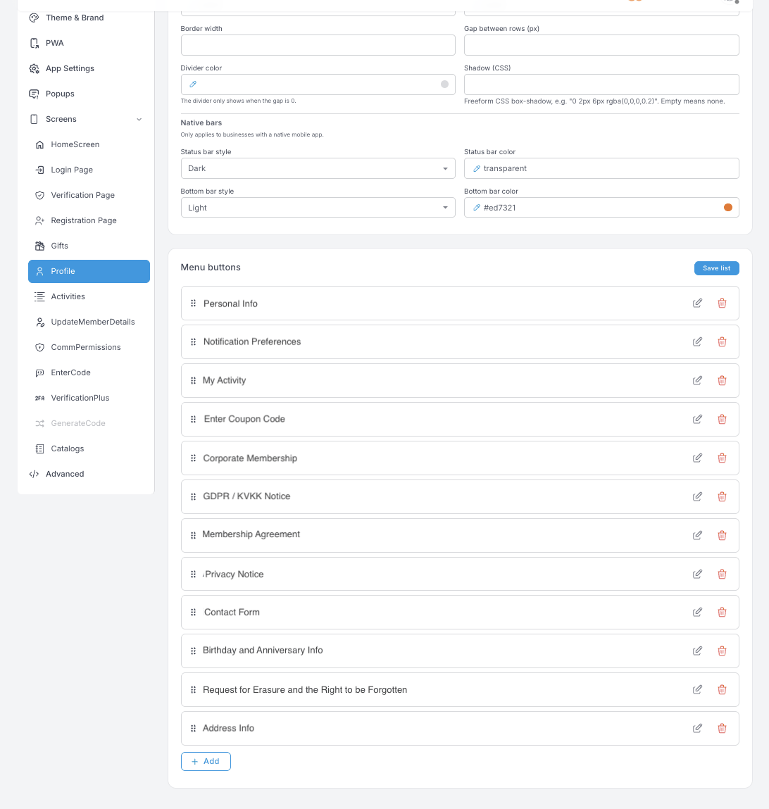
Menu buttons are the rows a member sees under Profile — personal details, notification preferences, activity, coupon codes, your legal notices, the contact form, the data-erasure request. Drag to reorder, pencil to edit the label and target, trash to remove.
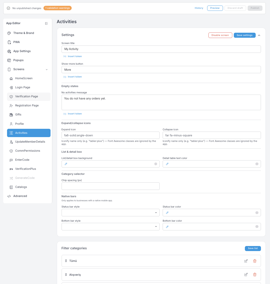
Activities — screen title, the Show-more button label and the empty state members see before their first purchase. Expand/collapse icons take Iconify names. Filter categories are the chips above the list, and the list is editable — the categories members can filter by are yours to define.
Utility screens — UpdateMemberDetails, CommPermissions, EnterCode, Catalogs
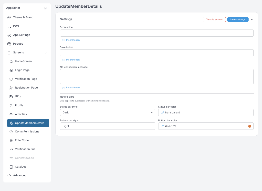
UpdateMemberDetails — screen title, save button, no-connection message. This is the form members use to complete or correct their own details.
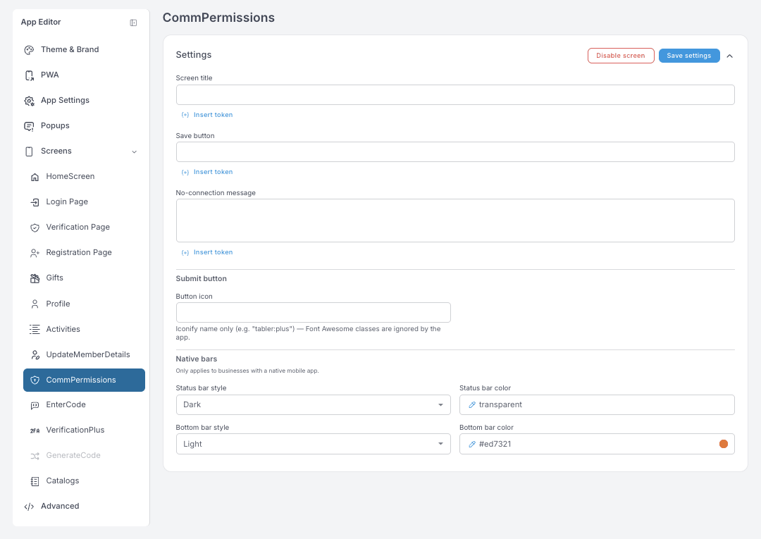
CommPermissions — the same three fields, plus a Button icon for the submit button. This is where members manage which channels they agree to hear from you on.
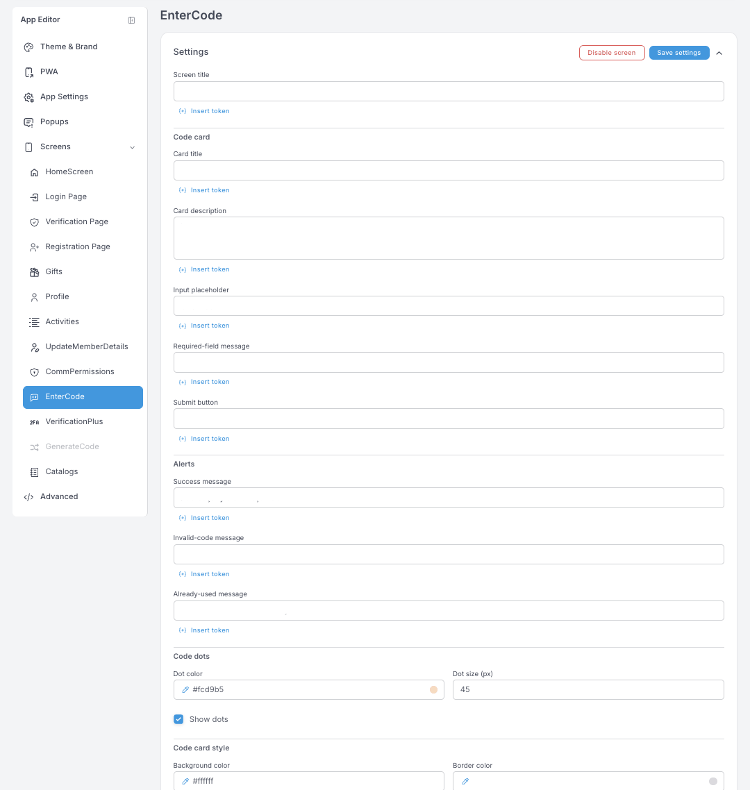
EnterCode — where members type a coupon code. Screen title, the code card's title and description, input placeholder, required-field message and submit label, plus three alerts: Success, Invalid-code and Already-used. Code dots are the visual placeholders for the digits — uncheck Show dots for a plain input instead.
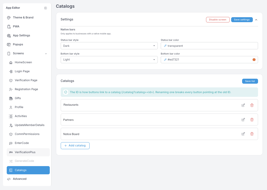
Catalogs — the browsable lists in your app: restaurants, partners, a notice board, a menu.
The ID is how buttons link to a catalog (/catalog?catalog=<id>). Renaming one breaks every button pointing at the old ID.
Advanced
These are raw settings with no validation. A bad value can break the app's styling for every member. They do go to the draft like everything else, so Discard draft undoes an experiment — but only until you publish it.
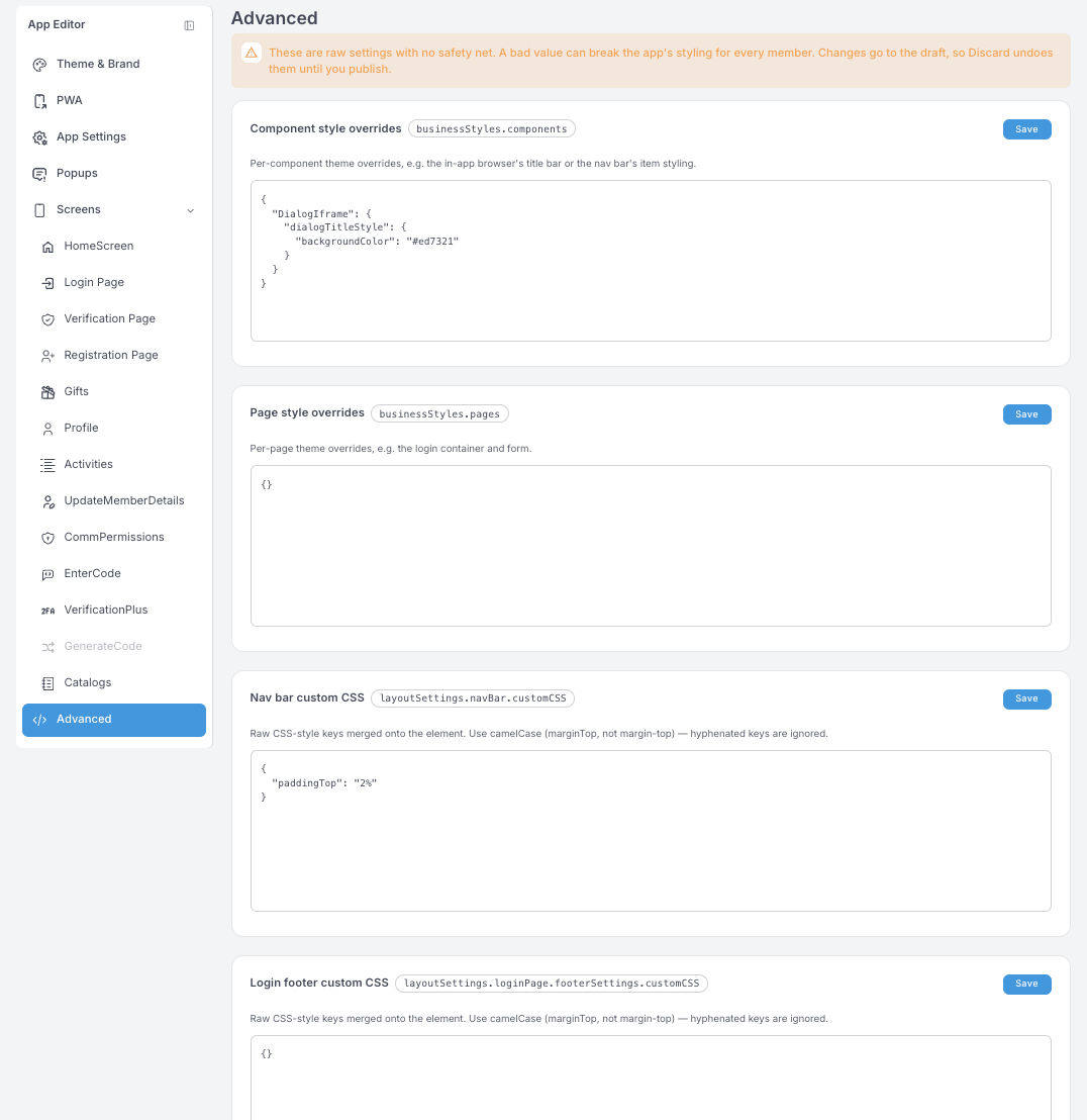
Four boxes, all JSON:
- Component style overrides (
businessStyles.components) — per-component theme overrides, such as the in-app browser's title bar or the nav bar's item styling. - Page style overrides (
businessStyles.pages) — per-page overrides, such as the login container and form. - Nav bar custom CSS and Login footer custom CSS — raw CSS-style keys merged onto that element.
One rule catches everyone: use camelCase. marginTop works; margin-top is silently ignored.
If you're not sure what a key does, ask support before saving here.
The editor is deep on purpose — an advanced user can shape nearly everything. For everyday work you'll rarely need more than Screens → HomeScreen and the carousels on it. Ready-made Templates are on the way, which will turn a bigger redesign into a one-click starting point instead of a component-by-component build.