Mobile app
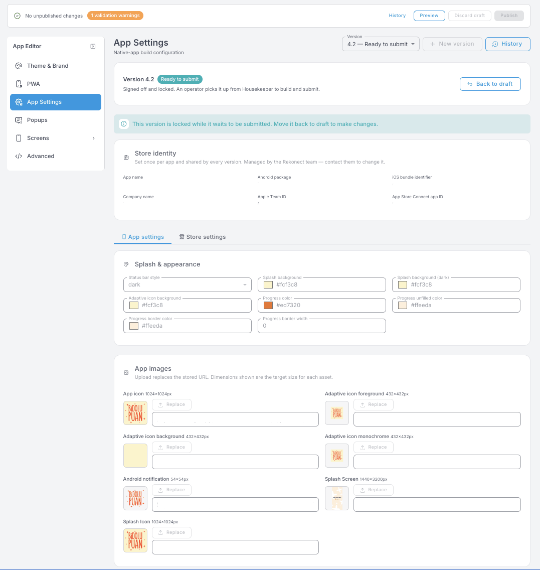
App Settings holds the artwork and colours for your native mobile app — the one people install from the App Store or Google Play. It is not the Webapp, and it is not the PWA install settings. You fill it in once, before the first submission, and come back only when you rebrand or ship a new version. Everything is kept per version: a version is a draft you can edit freely, and marking it Ready to submit locks it for whoever builds and submits the app.
The whole job is really one thing: hand your designer the size list further down and collect the files back.
Versions
A version moves through three states:
- Draft — you can change anything.
- Ready to submit — signed off and locked. Whoever builds the app picks it up from here.
- Locked versions can be reopened with Back to draft if something still needs changing.
New version starts the next one; History shows the previous ones. Marking a version ready doesn't put the app in the stores by itself — it hands over a signed-off configuration for the actual build and submission.
Store identity
App name, Android package, iOS bundle identifier, company name, Apple Team ID and App Store Connect app ID.
This block is read-only. It's set once per app and shared by every version, because changing it would mean a different app in the stores. Contact support if it genuinely needs to change.
App settings tab
Splash & appearance
The colours the app uses while it's launching, before your content appears.
| Field | What it controls |
|---|---|
| Status bar style | Whether the phone draws its own clock and battery icons light or dark over your screens. |
| Splash background | The background colour of the screen shown while the app opens, before content loads. |
| Splash background (dark) | The same, for phones set to dark theme. |
| Adaptive icon background | The background colour of the Android app icon. The system clips it to whatever icon shape the phone uses — round, squircle, square. |
| Progress color | The filled part of the loading bar shown while the app opens or a job is running. |
| Progress unfilled color | The part of the loading bar not yet filled. |
| Progress border color | The frame around the loading bar. |
| Progress border width | How thick that frame is. 0 means no border. |
App images
The icon and splash files that get built into the app itself. Every slot shows its target size — send those exact dimensions to your designer. Uploading a file replaces the stored URL for you, so you never need to touch the URL field.
| Asset | Size | What it is |
|---|---|---|
| App icon | 1024 × 1024 px | The master icon file. High-resolution source; Android derives the smaller sizes from it. |
| Adaptive icon foreground | 432 × 432 px | The front layer of Android's adaptive icon — usually the logo mark on its own, on a transparent background. |
| Adaptive icon background | 432 × 432 px | The back layer behind it. Usually a single flat colour. |
| Adaptive icon monochrome | 432 × 432 px | A single-colour version, used where Android draws icons in one colour (themed icons). |
| Android notification | 54 × 54 px | The small icon in the status bar when a notification arrives. Must be a simple, single-colour logo — anything detailed turns into a grey blob. |
| Splash Screen | 1440 × 3200 px | The full artwork of the launch screen. A background or design in your brand identity. |
| Splash Icon | 1024 × 1024 px | The logo shown in the middle of the splash screen. |
Store settings tab
The artwork that goes into the Google Play listing — what people see on the store page before they install.
| Asset | Size | What it is |
|---|---|---|
| Feature banner | 1024 × 500 px | The horizontal promo banner Google Play shows in the app's listing. Usually brand or logo plus a design that represents the app. |
| App icon | 512 × 512 px | The icon shown in the Google Play listing. Square, and best supplied with its background already baked in. |
| Screenshot 1 / 2 / 3 | 1320 × 2868 px | Promo screenshots of the app on the store page. Prepare three, from different screens of the app. |
This page covers the Android and Google Play assets. If your program also ships on iOS, support will tell you what the App Store build still needs. One part of it is yours to start early, and it applies here too: publishing under your company rather than under a person's name needs a D-U-N-S number on either store, and it can take weeks to arrive.
Preparing the artwork
A few things that save a round trip with your designer:
- Send the whole size list at once. Every asset above is a separate file at a fixed size — a designer working from one screenshot will get it wrong.
- Adaptive icon foreground, Adaptive icon monochrome and Android notification need transparent backgrounds. The colour behind them comes from Adaptive icon background.
- Keep the notification icon to a flat silhouette. Gradients and thin detail disappear at 54 px.
- Match Splash background to the background of your Splash Screen artwork, so nothing flashes a different colour while the app loads.
- Set Splash background (dark) too. If you skip it, phones on dark theme can show your logo on a colour you never chose.
- Screenshots for the store are marketing, not documentation — pick the three screens that best explain what members get.
The Native bars block on each screen in the App Editor — status and bottom bar style — also applies only to businesses with a native mobile app. Everything else in the App Editor affects the Webapp and the native app alike.